Die wirkliche Farbe: Über Farbe und Wirklichkeitstreue (True Color: About Color and Truthfulness)
For my BA thesis and project, I researched, wrote, visualized, sketched, and prototyped simultaneously. These processes moved back and forth, often overlapping, but always influencing one another. This way of working felt not only inspiring but also essential when dealing with topics such as color—particularly skin color—technology, representation, power structures, and responsibility.
Throughout this work, I developed six projects connected to specific passages in my thesis: “Color Gradient”, questioning the rigid categories imposed on a fluid color spectrum; “Defining Colors”, addressing the absurdity of assuming that ‘objective’ color definitions exist and the misplaced trust we place in technology’s supposed neutrality; “Black and White Reality”, exploring how people historically lived in different ‘(color) realities’ and what it means to move through a ‘black’ and ‘white’ world not only in images but in real life; “Color Composition” and “Hues”, examining the countless, ever-changing shades that make up our skin and the absurdity of assigning people to fixed color categories; and “Mirrored”, developed with “The TrueColors Toolkit”, where I explored how technology is calibrated—its underlying interests, processes, and power structures—and reflected on how (my) decisions can shape these systems.


“Wir können zwar versuchen, Farbwerte mit Hilfe von Sprache zu vergleichen, doch ist es uns nicht möglich, anhand dieser abzuleiten, was die*der Sprecher*in ‚wirklich‘ sieht. Denn Farbbezeichnungen, wie beispielsweise ‚Gelb‘, ‚Grün‘ oder ‚Blau‘ setzen dem fluiden Farbspektrum scharfe Grenzen und gleichzeitig gehen wir mit diesen Bezeichnungen auch sehr ungenau um” [While we can try to compare color values with language, we can not determine what the person speaking ‘really’ sees. Color terms such as ‘yellow’, ‘green’ or ‘blue’ set sharp boundaries to a fluid color spectrum and at the same time we are very imprecise with designating these.] (Knilli 2021: 10ff.).
Color Gradient challenges the rigid categories that colors are often confined to. By turning a rotary knob, viewers can navigate through shifting tones that resist clear classification and exist in between familiar color terms. These indeterminate hues highlight the subjective nature of color perception, contrasting with the supposed objectivity of the technical systems that define and reproduce color.
“Eine von Geburt an nicht sehende Person würde meinen, dass ‘Farben wie Schach oder Mathe ein rein gedankliches [Konzept] sind. [Sie sind] abstrakt. [...] ‚Grün‘ und ‚Blau‘ sind wie Vokabeln [unter denen ich – Jonas Hauer – mir] nichts optisches vorstellen kann’” [A person without sight since birth would think that “colors are like chess or math a purely mental concept. They are abstract. ‘Green’ and ‘blue’ are like vocabulary among which I – Jonas Hauer – can't visualise anything.] (Knilli 2021: 11).

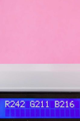
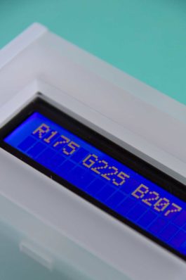
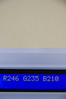
Defining Colors challenges the notion of objectivity in color systems like RGB. Codes such as ‘R244 G209 B220’ claim precision, yet for most people they remain abstract—numbers that reveal little beyond a rough sense of brightness or hue. In contrast, words like ‘pink’, ‘lilac’, or ‘violet’ instantly evoke visual associations. The work reflects on the trust placed in technology and its promise of neutrality, revealing instead that devices, programmed and calibrated by humans, always carry traces of subjectivity.
“Lange war es auch technisch gar nicht möglich, eine ‚objektive‘ optische ‚Wirklichkeit‘ einzufangen. Erst mit der Erfindung der Fotografie Mitte des 19. Jahrhunderts und einige Jahrzehnte später dann auch mit dem Durchbruch des Filmes – beides ‚schwarz‘-‚weiß‘ – hat sich diesbezüglich viel verändert, denn Fotografie und Film wurden als wissenschaftliche Werkzeuge eingeführt, die bis heute in der Regel ‘als exakt [und] empirisch, gänzlich im Dienste der Authentizität, Realität und Objektivität’ gesehen werden. Aber selbst ‚Schwarz‘-‚Weiß‘-Fotografie und -Film stellen eine gefilterte Version der visuellen ‚Wirklichkeit‘ dar, da das ‚Schwarz‘-‚Weiß‘-Bild für uns Menschen in der Regel nicht im realen Leben existiert” [For a long time it was also technically impossible to capture an ‘objective’ visual ‘reality’. Only with the invention of photography in the mid 19th century and a few decades later with the breakthrough of film – both ‘black’ and ‘white’ – a lot changed in this regard. Photography and film were introduced as scientific tools, which to this day are usually seen as “exact [and] empirical, wholly in the service of authenticity, reality and objectivity”. But even ‘black’ and ‘white’ photography and film represent a filtered version of visual ‘reality’, since for us humans the ‘black’ and ‘white’ image usually does not exist in real life.] (Knilli 2021: 12).
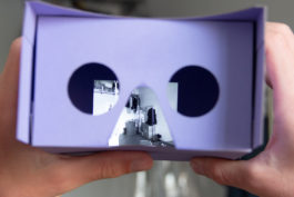
Black and White Reality reflects on how early photography and film shaped our idea of visual truth. For a long time, black-and-white images defined what was seen as ‘real,’ as if people once lived in different color realities. Yet color is fundamental to how we perceive the world. This project enables a live experience of a black-and-white reality using a simple setup—a mobile phone camera, monochrome filter, and spectacle frame—inviting reflection on how color, or its absence, shapes our sense of reality.
“Meist werden die Farben ‚Schwarz‘, ‚Rot‘, ‚Weiß‘, ‚Gelb‘ und ‚Braun‘ mit unterschiedlichen Hautfarben assoziiert. ‘[But] [w]ho has seen a black or red person, a white, a yellow, or brown?’ Auch diese Begriffe sind willkürliche Konstrukte und definitiv keine ‚(Farb)Wirklichkeiten‘. Der Gedanke, dass Menschen in unterschiedliche Farbkategorien gesteckt werden können, je nach dem was für ‚eine‘ Hautfarbe sie haben, wird schon an dem Punkt fragwürdig, wenn beachtet wird, dass allein eine Person schon ganz viele unterschiedliche Farbpigmente mit sich trägt und sich diese auch im Laufe des Jahres ändern können” [The colors ‘black’, ‘red’, ‘white’, ‘yellow’ and ‘brown’ are often associated with different skin tones. “[But] [w]ho has seen a black or red person, a white, a yellow, or brown?” These terms are arbitrary constructs and definitely not ‘(color)realities’. The idea that people can be put into different color categories, depending on what ‘one’ skin color they have, also becomes questionable when considering that every person carries many different color pigments with one and these can change throughout the year.] (Knilli 2021: 15).

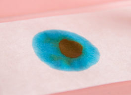
Color Compositions offers a visual reflection on the absurdity of categorizing people by skin color. Like most hues, skin tones are composed of countless pigments that shift with light, time, and context. Rather than a single fixed color, each person carries a dynamic composition of tones—an ever-changing palette that resists definition.
“Meist werden die Farben ‚Schwarz‘, ‚Rot‘, ‚Weiß‘, ‚Gelb‘ und ‚Braun‘ mit unterschiedlichen Hautfarben assoziiert. ‘[But] [w]ho has seen a black or red person, a white, a yellow, or brown?’ Auch diese Begriffe sind willkürliche Konstrukte und definitiv keine ‚(Farb)Wirklichkeiten‘. Der Gedanke, dass Menschen in unterschiedliche Farbkategorien gesteckt werden können, je nach dem was für ‚eine‘ Hautfarbe sie haben, wird schon an dem Punkt fragwürdig, wenn beachtet wird, dass allein eine Person schon ganz viele unterschiedliche Farbpigmente mit sich trägt und sich diese auch im Laufe des Jahres ändern können” [The colors ‘black’, ‘red’, ‘white’, ‘yellow’ and ‘brown’ are often associated with different skin tones. “[But] [w]ho has seen a black or red person, a white, a yellow, or brown?” These terms are arbitrary constructs and definitely not ‘(color)realities’. The idea that people can be put into different color categories, depending on what ‘one’ skin color they have, also becomes questionable when considering that every person carries many different color pigments with one and these can change throughout the year.] (Knilli 2021: 15).


Hues highlights the often-overlooked diversity of pigments within each person. On closer observation, distinct hues emerge, forming a unique, continuously shifting color palette that reflects individual variation.
“Es wird also ersichtlich, dass es anfangs nicht wegen technischen Umständen dazu kam, dass Weiße ‚besser‘ abgebildet werden ‚konnten‘ und teilweise immer noch ‚können‘ als People of Colour – sondern ganz im Gegenteil: Der Grund dafür ist, dass Weiße Entscheidungsträger*innen – in einer stark von Sexismus, Rassismus und Heteronormativität geprägten Industrie – Weiße als die Norm sahen und diese priviligierten. Auslöser dafür waren neben Unwissen und Ignoranz auch wirtschaftliche Interessen. Es gab und gibt zwar Möglichkeiten, diese normierten Gebrauchsformen, Strukturen und Technologien im Rahmen der fotografischen Medien zu umgehen, doch wird der Körper von People of Colour innerhalb dieses Diskurses ‘nur im Zusammenhang von Schwierigkeiten erwähnt’. So war es nur mit Hilfe von zusätzlichen Lichtquellen und technischen Anpassungen – die sich Fotograf*innen auch erst im Laufe der Jahre durch Erfahrung aneignen konnten – möglich, People of Colour annähernd abzubilden und sie somit (dauerhaft) sichtbar zu machen” [So it becomes clear that initially it was not due to technical circumstances that white people ‘could’ and partially still ‘can’ be depicted ‘better’ than People of Color – quite the opposite: the reason is that white people as decision-makers determined white people as the norm and privileged them in an industry heavily influenced by sexism, racism and heteronormativity. This was not only a consequence of lacking knowledge and ignorance, but also because of economic interests. While there were and are ways to circumvent these standardized uses, structures and technologies within the framework of photographic media, bodies of People of color always appear in the context of difficulties. It was only with the help of additional light sources and technical adjustments – which photographers have only been able to acquire over the years through experience – possible to approximately depict People of color and thus make them (permanently) visible.] (Knilli 2021: 18ff.).
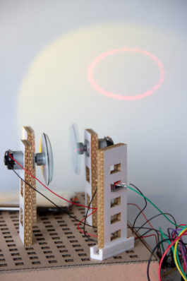
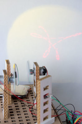
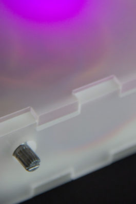
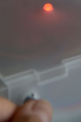
Mirrored examines the mirror as both a literal and symbolic tool. While a mirror can reflect any image, historically not everyone has been—or still is—accurately represented in cameras. This is not a technical limitation, but the result of parameters set by predominantly white decision-makers. The project highlights this paradox through a symbolic spotlight and the modular TrueColors Toolkit, which lets users adjust technical settings and explore how such choices shape representation.
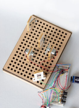
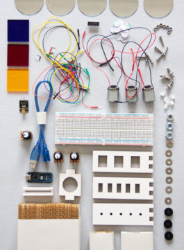
The TrueColors Toolkit is a modular system designed to explore, question, and manipulate physical phenomena and technical conditions. Made from accessible and sustainable materials—mainly cardboard and hardware-store components—it can be continuously adapted, expanded, and repurposed. The basic setup includes a breadboard, Arduino Nano, DC motors, LEDs, mirrors, color filters, rotary knobs, and various plug-in elements. While instructions guide technical connections, users are encouraged to modify, ignore, or extend components, creating individual setups that both support experimentation and visually reflect their contributions to the project’s ongoing discussion.
Format: Publication, Interactive Objects, Image-Based Work
Tasks: Concept, Research, Writing, Prototyping, Building, Layout
Year: 2021
Die wirkliche Farbe: Über Farbe und Wirklichkeitstreue (True Color: About Color and Truthfulness)
For my BA thesis and project, I researched, wrote, visualized, sketched, and prototyped simultaneously. These processes moved back and forth, often overlapping, but always influencing one another. This way of working felt not only inspiring but also essential when dealing with topics such as color—particularly skin color—technology, representation, power structures, and responsibility.
Throughout this work, I developed six projects connected to specific passages in my thesis: “Color Gradient”, questioning the rigid categories imposed on a fluid color spectrum; “Defining Colors”, addressing the absurdity of assuming that ‘objective’ color definitions exist and the misplaced trust we place in technology’s supposed neutrality; “Black and White Reality”, exploring how people historically lived in different ‘(color) realities’ and what it means to move through a ‘black’ and ‘white’ world not only in images but in real life; “Color Composition” and “Hues”, examining the countless, ever-changing shades that make up our skin and the absurdity of assigning people to fixed color categories; and “Mirrored”, developed with “The TrueColors Toolkit”, where I explored how technology is calibrated—its underlying interests, processes, and power structures—and reflected on how (my) decisions can shape these systems.
“Wir können zwar versuchen, Farbwerte mit Hilfe von Sprache zu vergleichen, doch ist es uns nicht möglich, anhand dieser abzuleiten, was die*der Sprecher*in ‚wirklich‘ sieht. Denn Farbbezeichnungen, wie beispielsweise ‚Gelb‘, ‚Grün‘ oder ‚Blau‘ setzen dem fluiden Farbspektrum scharfe Grenzen und gleichzeitig gehen wir mit diesen Bezeichnungen auch sehr ungenau um” [While we can try to compare color values with language, we can not determine what the person speaking ‘really’ sees. Color terms such as ‘yellow’, ‘green’ or ‘blue’ set sharp boundaries to a fluid color spectrum and at the same time we are very imprecise with designating these.] (Knilli 2021: 10ff.).
Color Gradient challenges the rigid categories that colors are often confined to. By turning a rotary knob, viewers can navigate through shifting tones that resist clear classification and exist in between familiar color terms. These indeterminate hues highlight the subjective nature of color perception, contrasting with the supposed objectivity of the technical systems that define and reproduce color.
“Eine von Geburt an nicht sehende Person würde meinen, dass ‘Farben wie Schach oder Mathe ein rein gedankliches [Konzept] sind. [Sie sind] abstrakt. [...] ‚Grün‘ und ‚Blau‘ sind wie Vokabeln [unter denen ich – Jonas Hauer – mir] nichts optisches vorstellen kann’” [A person without sight since birth would think that “colors are like chess or math a purely mental concept. They are abstract. ‘Green’ and ‘blue’ are like vocabulary among which I – Jonas Hauer – can't visualise anything.] (Knilli 2021: 11).
Defining Colors challenges the notion of objectivity in color systems like RGB. Codes such as ‘R244 G209 B220’ claim precision, yet for most people they remain abstract—numbers that reveal little beyond a rough sense of brightness or hue. In contrast, words like ‘pink’, ‘lilac’, or ‘violet’ instantly evoke visual associations. The work reflects on the trust placed in technology and its promise of neutrality, revealing instead that devices, programmed and calibrated by humans, always carry traces of subjectivity.
“Lange war es auch technisch gar nicht möglich, eine ‚objektive‘ optische ‚Wirklichkeit‘ einzufangen. Erst mit der Erfindung der Fotografie Mitte des 19. Jahrhunderts und einige Jahrzehnte später dann auch mit dem Durchbruch des Filmes – beides ‚schwarz‘-‚weiß‘ – hat sich diesbezüglich viel verändert, denn Fotografie und Film wurden als wissenschaftliche Werkzeuge eingeführt, die bis heute in der Regel ‘als exakt [und] empirisch, gänzlich im Dienste der Authentizität, Realität und Objektivität’ gesehen werden. Aber selbst ‚Schwarz‘-‚Weiß‘-Fotografie und -Film stellen eine gefilterte Version der visuellen ‚Wirklichkeit‘ dar, da das ‚Schwarz‘-‚Weiß‘-Bild für uns Menschen in der Regel nicht im realen Leben existiert” [For a long time it was also technically impossible to capture an ‘objective’ visual ‘reality’. Only with the invention of photography in the mid 19th century and a few decades later with the breakthrough of film – both ‘black’ and ‘white’ – a lot changed in this regard. Photography and film were introduced as scientific tools, which to this day are usually seen as “exact [and] empirical, wholly in the service of authenticity, reality and objectivity”. But even ‘black’ and ‘white’ photography and film represent a filtered version of visual ‘reality’, since for us humans the ‘black’ and ‘white’ image usually does not exist in real life.] (Knilli 2021: 12).
Black and White Reality reflects on how early photography and film shaped our idea of visual truth. For a long time, black-and-white images defined what was seen as ‘real,’ as if people once lived in different color realities. Yet color is fundamental to how we perceive the world. This project enables a live experience of a black-and-white reality using a simple setup—a mobile phone camera, monochrome filter, and spectacle frame—inviting reflection on how color, or its absence, shapes our sense of reality.
“Meist werden die Farben ‚Schwarz‘, ‚Rot‘, ‚Weiß‘, ‚Gelb‘ und ‚Braun‘ mit unterschiedlichen Hautfarben assoziiert. ‘[But] [w]ho has seen a black or red person, a white, a yellow, or brown?’ Auch diese Begriffe sind willkürliche Konstrukte und definitiv keine ‚(Farb)Wirklichkeiten‘. Der Gedanke, dass Menschen in unterschiedliche Farbkategorien gesteckt werden können, je nach dem was für ‚eine‘ Hautfarbe sie haben, wird schon an dem Punkt fragwürdig, wenn beachtet wird, dass allein eine Person schon ganz viele unterschiedliche Farbpigmente mit sich trägt und sich diese auch im Laufe des Jahres ändern können” [The colors ‘black’, ‘red’, ‘white’, ‘yellow’ and ‘brown’ are often associated with different skin tones. “[But] [w]ho has seen a black or red person, a white, a yellow, or brown?” These terms are arbitrary constructs and definitely not ‘(color)realities’. The idea that people can be put into different color categories, depending on what ‘one’ skin color they have, also becomes questionable when considering that every person carries many different color pigments with one and these can change throughout the year.] (Knilli 2021: 15).
Color Compositions offers a visual reflection on the absurdity of categorizing people by skin color. Like most hues, skin tones are composed of countless pigments that shift with light, time, and context. Rather than a single fixed color, each person carries a dynamic composition of tones—an ever-changing palette that resists definition.
“Meist werden die Farben ‚Schwarz‘, ‚Rot‘, ‚Weiß‘, ‚Gelb‘ und ‚Braun‘ mit unterschiedlichen Hautfarben assoziiert. ‘[But] [w]ho has seen a black or red person, a white, a yellow, or brown?’ Auch diese Begriffe sind willkürliche Konstrukte und definitiv keine ‚(Farb)Wirklichkeiten‘. Der Gedanke, dass Menschen in unterschiedliche Farbkategorien gesteckt werden können, je nach dem was für ‚eine‘ Hautfarbe sie haben, wird schon an dem Punkt fragwürdig, wenn beachtet wird, dass allein eine Person schon ganz viele unterschiedliche Farbpigmente mit sich trägt und sich diese auch im Laufe des Jahres ändern können” [The colors ‘black’, ‘red’, ‘white’, ‘yellow’ and ‘brown’ are often associated with different skin tones. “[But] [w]ho has seen a black or red person, a white, a yellow, or brown?” These terms are arbitrary constructs and definitely not ‘(color)realities’. The idea that people can be put into different color categories, depending on what ‘one’ skin color they have, also becomes questionable when considering that every person carries many different color pigments with one and these can change throughout the year.] (Knilli 2021: 15).
Hues highlights the often-overlooked diversity of pigments within each person. On closer observation, distinct hues emerge, forming a unique, continuously shifting color palette that reflects individual variation.
“Es wird also ersichtlich, dass es anfangs nicht wegen technischen Umständen dazu kam, dass Weiße ‚besser‘ abgebildet werden ‚konnten‘ und teilweise immer noch ‚können‘ als People of Colour – sondern ganz im Gegenteil: Der Grund dafür ist, dass Weiße Entscheidungsträger*innen – in einer stark von Sexismus, Rassismus und Heteronormativität geprägten Industrie – Weiße als die Norm sahen und diese priviligierten. Auslöser dafür waren neben Unwissen und Ignoranz auch wirtschaftliche Interessen. Es gab und gibt zwar Möglichkeiten, diese normierten Gebrauchsformen, Strukturen und Technologien im Rahmen der fotografischen Medien zu umgehen, doch wird der Körper von People of Colour innerhalb dieses Diskurses ‘nur im Zusammenhang von Schwierigkeiten erwähnt’. So war es nur mit Hilfe von zusätzlichen Lichtquellen und technischen Anpassungen – die sich Fotograf*innen auch erst im Laufe der Jahre durch Erfahrung aneignen konnten – möglich, People of Colour annähernd abzubilden und sie somit (dauerhaft) sichtbar zu machen” [So it becomes clear that initially it was not due to technical circumstances that white people ‘could’ and partially still ‘can’ be depicted ‘better’ than People of Color – quite the opposite: the reason is that white people as decision-makers determined white people as the norm and privileged them in an industry heavily influenced by sexism, racism and heteronormativity. This was not only a consequence of lacking knowledge and ignorance, but also because of economic interests. While there were and are ways to circumvent these standardized uses, structures and technologies within the framework of photographic media, bodies of People of color always appear in the context of difficulties. It was only with the help of additional light sources and technical adjustments – which photographers have only been able to acquire over the years through experience – possible to approximately depict People of color and thus make them (permanently) visible.] (Knilli 2021: 18ff.).
Mirrored examines the mirror as both a literal and symbolic tool. While a mirror can reflect any image, historically not everyone has been—or still is—accurately represented in cameras. This is not a technical limitation, but the result of parameters set by predominantly white decision-makers. The project highlights this paradox through a symbolic spotlight and the modular TrueColors Toolkit, which lets users adjust technical settings and explore how such choices shape representation.
The TrueColors Toolkit is a modular system designed to explore, question, and manipulate physical phenomena and technical conditions. Made from accessible and sustainable materials—mainly cardboard and hardware-store components—it can be continuously adapted, expanded, and repurposed. The basic setup includes a breadboard, Arduino Nano, DC motors, LEDs, mirrors, color filters, rotary knobs, and various plug-in elements. While instructions guide technical connections, users are encouraged to modify, ignore, or extend components, creating individual setups that both support experimentation and visually reflect their contributions to the project’s ongoing discussion.